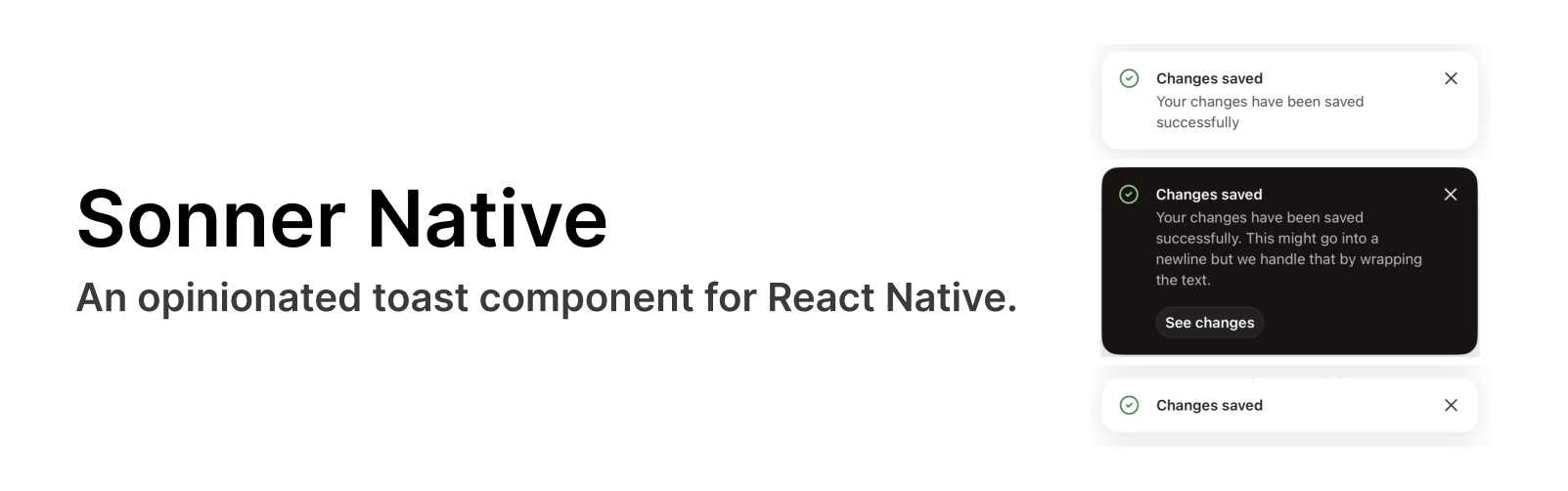
Introduction
Sonner Native is an opinionated toast component for React Native. A port of @emilkowalski's sonner. It is customizable and performant toast library for React Native, built with Reanimated 3. It provides a simple API to display toast notifications with various options and configurations.
Features
- API fully matches Sonner's
- Multiple variants, including
success,error,warning,custom,promise - Promise variant with built-in loading state
- Custom JSX with the custom variant
- Top or bottom positions
- Title and description
- Action button with a callback
- Custom icons
- Optionally dismissable with swipe, configurable left or up
- Dismissable with toast.dismiss(), one or all toasts
- Highly performant using Reanimated 3, 60 FPS
- Dark mode built-in
- Works with Expo
- Customizable via style props
- Works outside of React components
Installation
yarn add sonner-native
Requirements
To use this package, you also need to install its peer dependencies. Check out their documentation for more information:
- React Native Reanimated
- React Native Gesture Handler
- React Native Safe Area Context
- React Native SVG
Getting started
In your App.tsx/entry point
import { Toaster } from 'sonner-native';

function App() {
  return (
    <View>
      <NavigationContainer>...</NavigationContainer>
      <Toaster />
    </View>
  );
}
Show a toast
import { toast } from 'sonner-native';

function SomeComponent() {
  return (
    <Button
      title="Show Toast"
      onPress={() => toast('Hello, World!')}
    />
  );
}
Web support
Even though Sonner Native works on the web, it is not recommended to use it there. Instead, use the original Sonner.
The following setup is recommended. Add a sonner.ts and sonner.web.ts file to your project and import from there instead of from this library directly. That way, sonner will be used on the web and sonner-native on native.
// sonner.ts
export * from 'sonner-native';
// sonner.web.ts
export * from 'sonner';
Examples
An example can be found in the example folder.