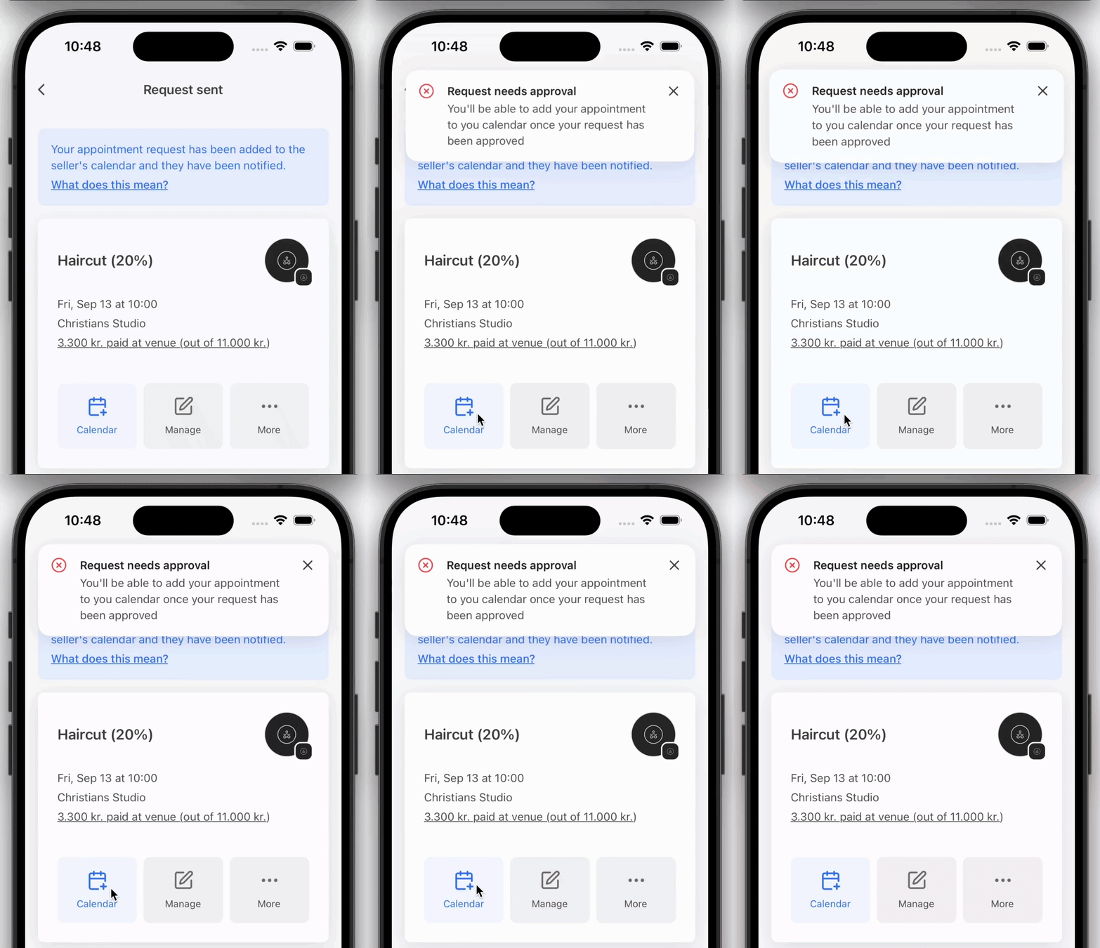
toast()
toast() is used to display a toast message. It can be used outside of React.
Basic toast
To display a simple toast message, use the toast() function. You can pass a title and optional settings.
import { toast } from 'sonner-native';

toast('This is a basic toast message.');
Alternatively, you can pass an object as the second argument with additional options, which will override any options provided to the Toaster component if specified.
import { toast } from 'sonner-native';

toast.success('Operation successful!', {
  style: { backgroundColor: 'blue' },
  description: 'Everything worked as expected.',
  duration: 6000,
  icon: <SomeIcon />,
});
Variations
Success Toast
The toast.success() function allows you to display a success message. By default, it renders a checkmark icon in front of the message.
toast.success('My success toast');
Error
Use the toast.error() function to display an error message. By default, it renders a X icon in front of the message.
toast.error('My error toast');
Warning
The toast.warning() function can be used to display a warning message. By default, it renders a warning icon in front of the message.
toast.warning('My warning toast');
Action
Renders an action button with a callback function. The action object should contain a label and an onClick function. The action and its label can be customized with the actionButtonStyles and actionButtonTextStyles params, respectively.
toast('My action toast', {
  action: {
    label: 'Action',
    onClick: () => console.log('Action!'),
  },
});
action can also be a JSX element:
toast('My action toast', {
  action: <Button title="Action" onPress={() => console.log('Action!')} />,
});
Cancel
Renders a cancel button with a callback function. The cancel object should contain a label and an onClick function. The cancel button and its label can be customized with the cancelButtonStyles and cancelButtonTextStyles params, respectively.
toast('My cancel toast', {
  cancel: {
    label: 'Cancel',
    onClick: () => console.log('Cancel!'),
  },
});
Promises
The toast.promise function can be used to display a toast message while a promise is in progress, and update the message based on the promise's success or failure.
const fetchData = async () => {
  try {
    const data = await fetch('/api/data');
    return data;
  } catch (error) {
    throw new Error('Failed to fetch data');
  }
};

const toastId = toast.promise(fetchData(), {
  loading: 'Loading data...',
  success: (data) => `Data loaded: ${data}`,
  error: 'Error fetching data',
});
Loading
The toast.loading function can be used to display a loading message. By default, it renders ActivityIndicator in front of the message.
toast.loading('Loading...');
In this example, the toast.promise function will display a "Loading data..." message while the fetchData promise is in progress, and update the message to the success or error text based on the promise's outcome.
Custom JSX
You can pass custom JSX elements to the toast function to render more complex content:
toast.custom(
  <View>
    <Text>Custom toast content</Text>
    <Button title="Close" onPress={() => toast.dismiss()} />
  </View>
);
Other
Updating existing toasts
You can update an existing toast by using the toast function, passing the toast ID in the options object:
const id = toast('Hello');

toast.success('Updated!', {
  id,
});
Callbacks
There are two callbacks, onAutoClose and onDismiss, that can be used to execute code when the toast is auto-closed (after the duration timeout) or manually dismissed, respectively.
toast('Hello', {
  onAutoClose: () => console.log('Auto-closed!'),
  onDismiss: () => console.log('Manually dismissed!'),
});
Infinite toasts
Pass duration as Infinity to make the toast stay until manually dismissed:
toast('Hello', {
  duration: Infinity,
});
Dismissing toasts
To dismiss a toast, call toast.dismiss with the toast ID:
const id = toast('Hello');

toast.dismiss(id);
You can also dismiss all toasts by calling toast.dismiss() without an ID:
toast('Hello');
toast('World');

toast.dismiss();
Wiggling toasts

To make a toast wiggle, call toast.wiggle with the toast ID:
const id = toast('Hello');

toast.wiggle(id);
Toasts can also be automatically wiggled by passing the autoWiggleOnUpdate prop to Toaster:
API Reference
| Property | Description | Default |
|---|---|---|
| description | Toast's description, renders underneath the title. | - |
| closeButton | Adds a close button. | false |
| invert | Dark toast in light mode and vice versa. | false |
| important | Control the sensitivity of the toast for screen readers | false |
| duration | Time in milliseconds that should elapse before automatically closing the toast. | 4000 |
| position | Position of the toast. | top-center |
| dismissible | If false, it'll prevent the user from dismissing the toast. | true |
| icon | Icon displayed in front of toast's text, aligned vertically. | - |
| action | Renders a primary button, clicking it will close the toast. | - |
| id | Custom id for the toast. | - |
| onDismiss | The function gets called when either the close button is clicked, or the toast is swiped. | - |
| onAutoClose | Function that gets called when the toast disappears automatically after it's timeout (duration` prop). | - |
| unstyled | Removes the default styling, which allows for easier customization. | false |
| actionButtonStyles | Styles for the action button | {} |
| actionButtonTextStyles | Styles for the action button text | {} |
| cancelButtonStyles | Styles for the cancel button | {} |
| cancelButtonTextStyles | Styles for the cancel button text | {} |
| richColors | Makes error and success state more colorful | false |